
Random Pics of Nextmod IS350 / APH S2000


 05-19-2009, 07:57 AM
#7
Registered User

Join Date: Nov 2005
Location: Orange County CA
Posts: 5,749
Likes: 0
Received 0 Likes
on
0 Posts
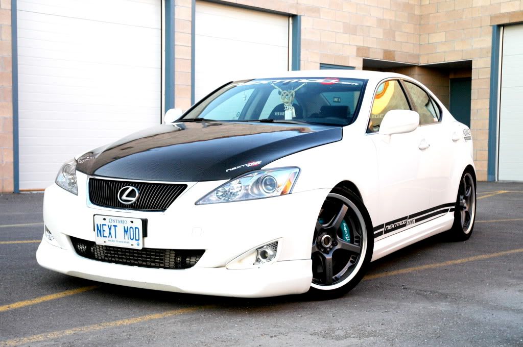
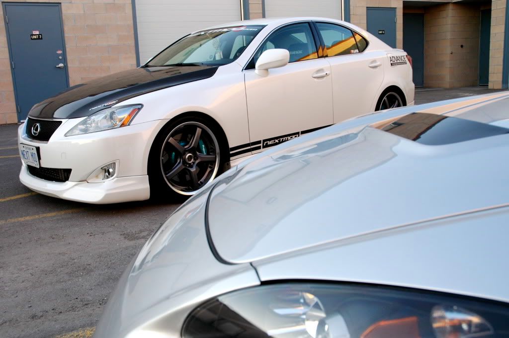
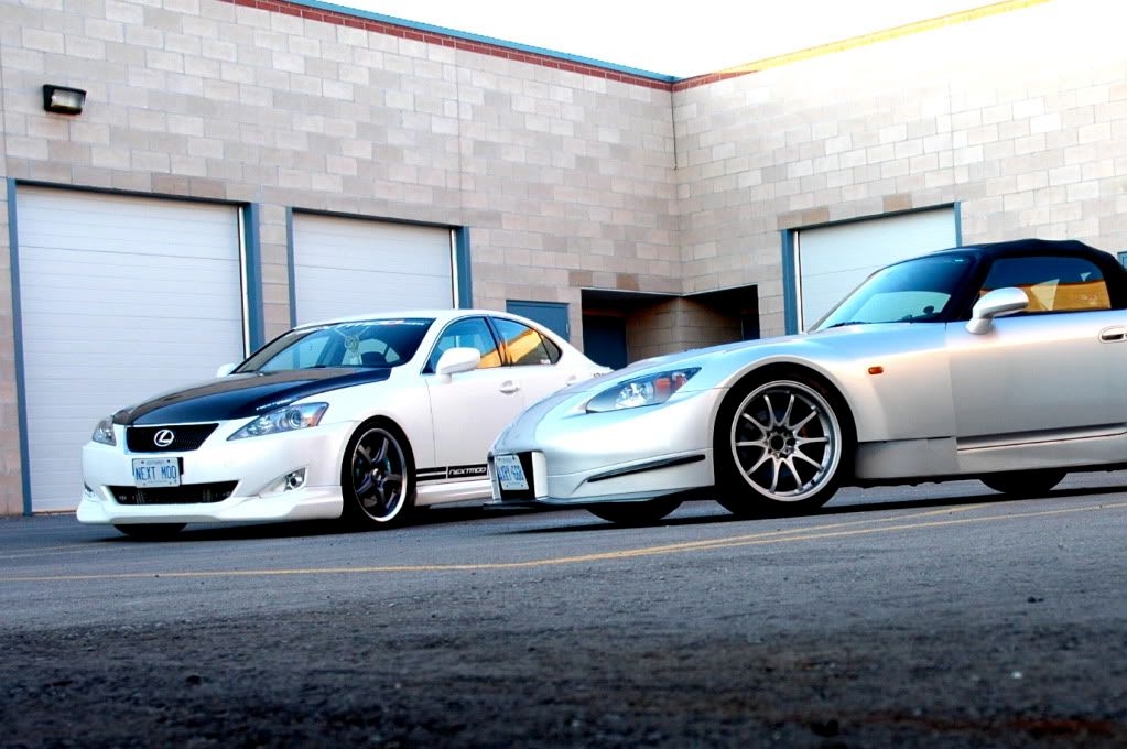
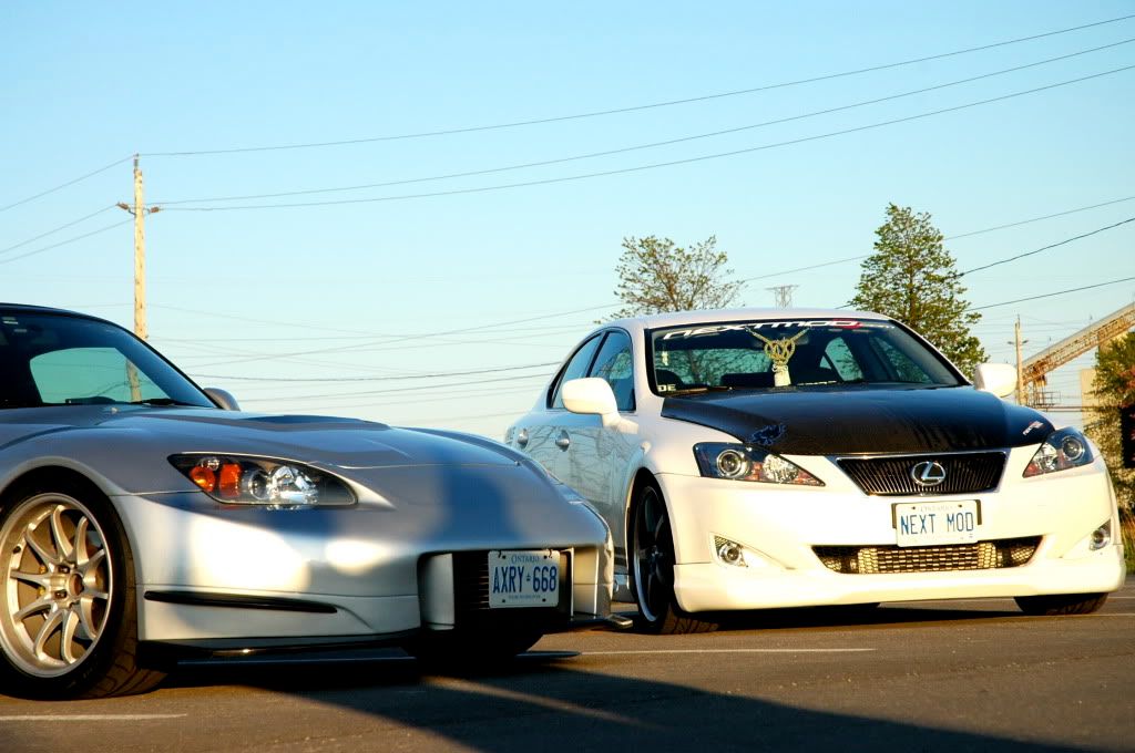
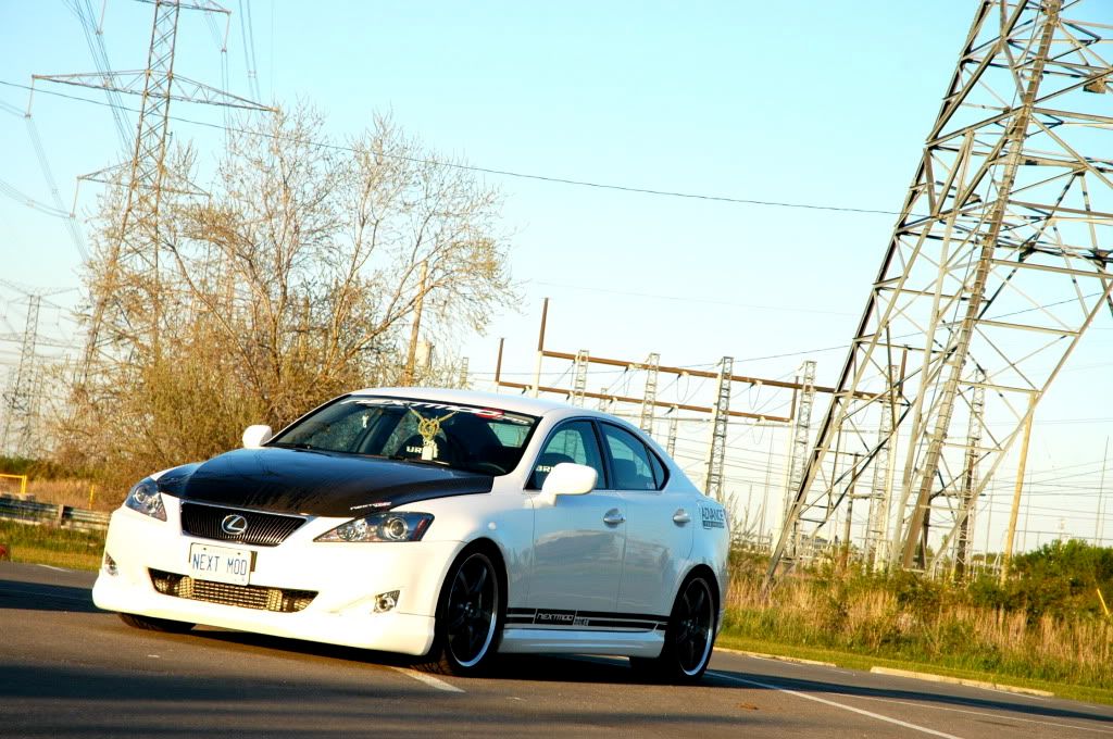
I think the graphics on the IS make it look stumpy  I like the mods, but I would lose the stripes at the bottom and re-locate the nextmod logo....IMO it would make the car look better.
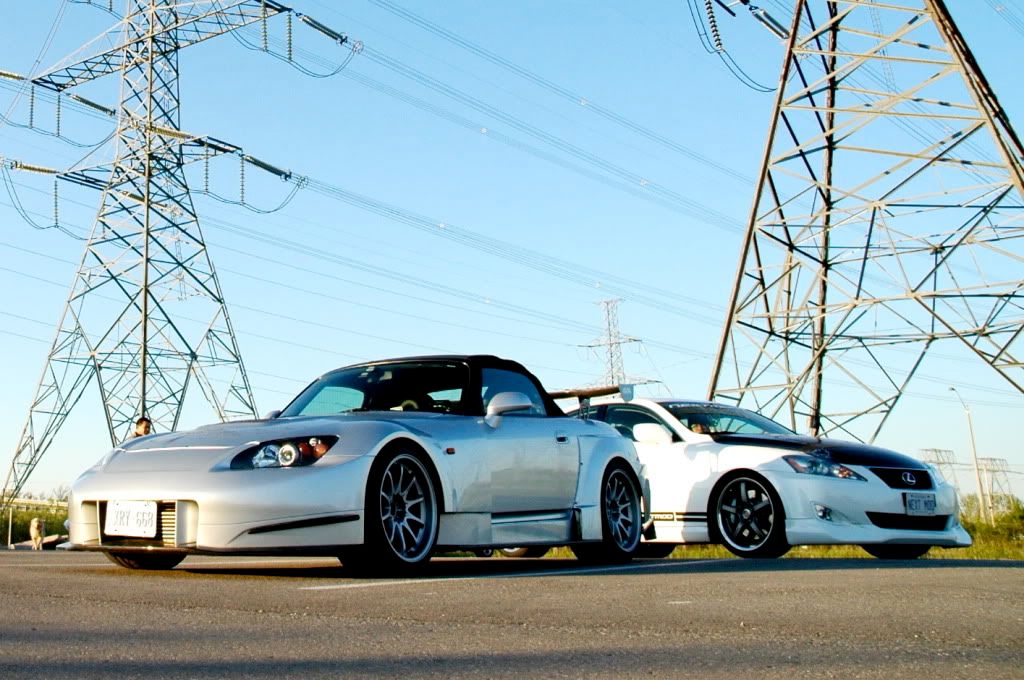
Love the S !!!!!!!!!!!!!!!!!!!!!!!!
I like the mods, but I would lose the stripes at the bottom and re-locate the nextmod logo....IMO it would make the car look better.Love the S
!!!!!!!!!!!!!!!!!!!!!!!!
Trending Topics
 Those decals are killin the look
05-19-2009, 09:06 AM
Those decals are killin the look
05-19-2009, 09:06 AM
#9

Join Date: Jan 2007
Location: Atlanta, GA
Posts: 4,852
Likes: 0
Received 0 Likes
on
0 Posts
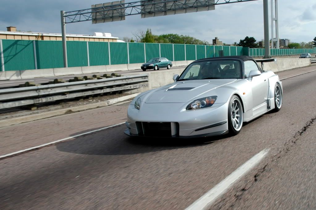
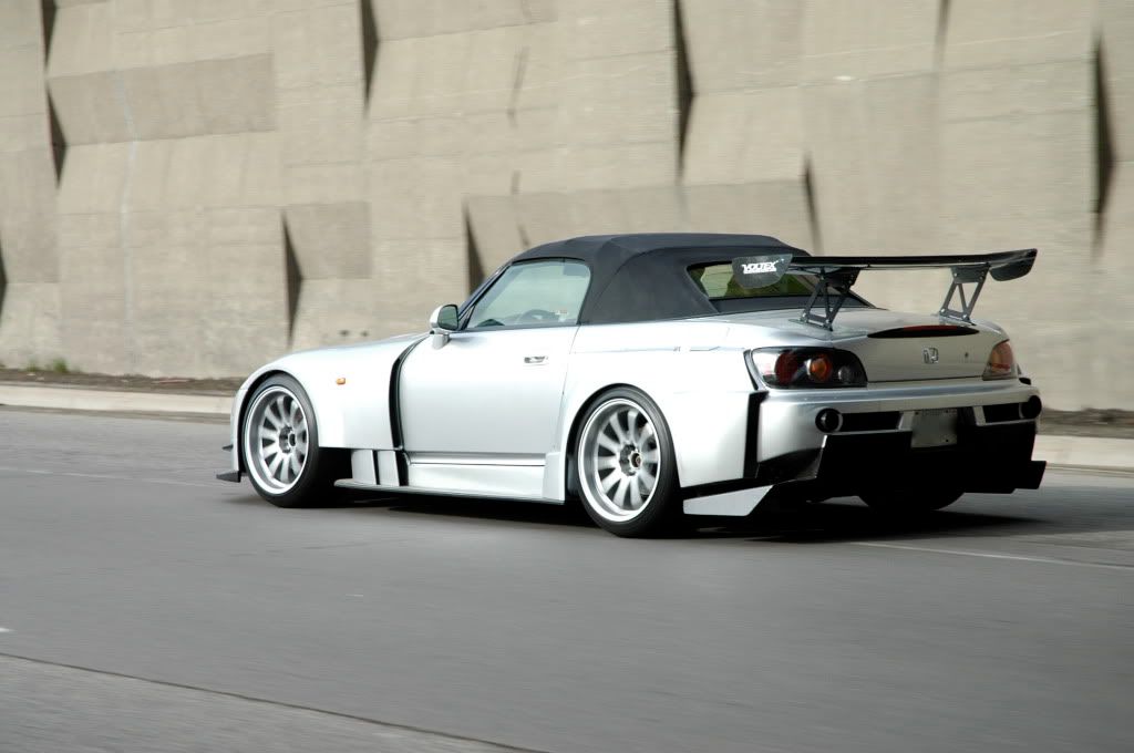
The S2000 is ****ing gorgeous.
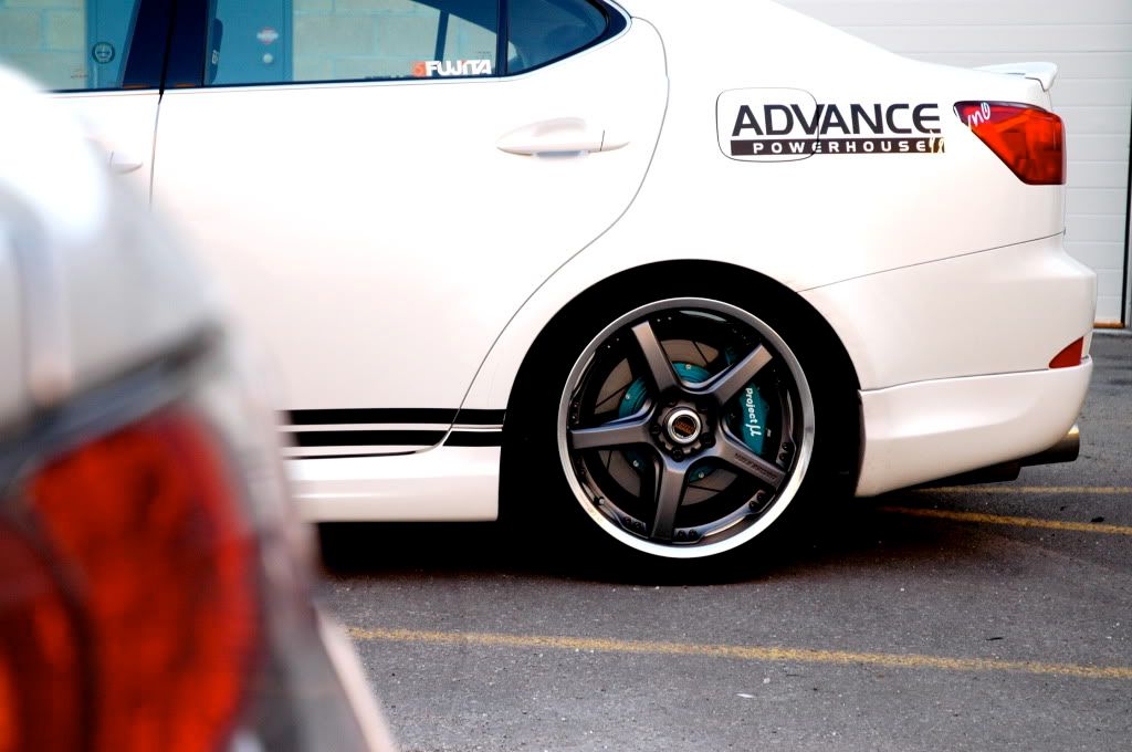
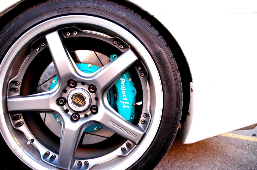
Lexus is a clash of colors and looks tacky - although I am very aware of what all the parts are on there. WTF is PMu thinking with their teal... ?
Lexus is a clash of colors and looks tacky - although I am very aware of what all the parts are on there. WTF is PMu thinking with their teal... ?
05-19-2009, 12:03 PM
#10
Registered User
Join Date: Nov 2005
Location: Orange County CA
Posts: 5,749
Likes: 0
Received 0 Likes
on
0 Posts
Originally Posted by rnye,May 19 2009, 09:06 AM
Lexus is a clash of colors and looks tacky - although I am very aware of what all the parts are on there. WTF is PMu thinking with their teal... ?
I would paint the hood (or at least the edges so it didn't look so wide... then maybe use black vinyl on the roof and the top section of the trunk... so it flowed better). After that I would color match the center of the wheels and leave the teal brakes then remove the graphics and go with something a little more clean/subtle that still showed the company logo and call it a day

just my .02cents
